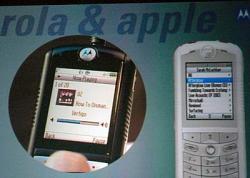
This is not the iPhone

I've seen blogs and news items calling the new Moto phone with iTunes support the "iPhone" and I've been cringing at each one. Finally, MacNews.net.tc came up with a pic (via Engadget) so we can see for ourselves this is *definitely* not the proverbial "iPhone". Look at the UI - it's the same ugly, unusable, user-hostile Motorola UI that's found on all their phones. Yes, the screen shots above look superficially like the iPod Photo UI, but you can see Moto's UI peeking out from below: the font, the soft buttons and the physical menu button below the screen give a clue this is just a Moto phone with FairPlay DRM support and little else.
When I think of an Apple iPhone - which I predicted would happen within 18 months - I'm thinking of a phone with Apple's unique UI sensibilities and design ethos embedded in every inch of the device. In other words, I'm looking for the iPod of mobile phones. I'm positive this is under development as we speak, and this is just the first step towards that final outcome, but it's not it. Maybe on Monday Steve will demo this thing and we'll see that I'm wrong about this. I would love to be, but I don't think so.
-Russ