What's Wrong with All The "My RSS" Portals

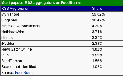
With the appearance of My AOL, Microsoft's Start.com and Google's RSS home page it seems that My Yahoo! has some company in the "RSS Home Page" space. These competitors are right to jump in as according to FeedBurner, Yahoo! is currently enjoying nearly 60% of the aggregator market. Though it's nice to see that mainstream portals are jumping onto the RSS bandwagon (lead by my employer), the problem is that all of these services generally suck.
Why? Because they all break a very simple rule: You should only see an RSS item once. If I go to a page and see the weather for the day, that's it. I don't need to see the weather again until it changes drastically or tomorrow. After I've seen it once, it's noise. If I see a news story headline, that's it, I don't need to see it again unless there is something new. It's very simple. There's too much information out there in the world to constantly have to search for updates on my own customized news page. New information should stand out, and old information should go away.
The way all these "Box Aggregators" are set up, you have all these boxes on the page with different feeds in them. At a glance you have no idea what is new and what is old, nor do you have any idea when things were updated relative to each other. I don't necessarily subscribe to the "River of News" method, but honestly, I'd rather have that sort of basic interface than a bunch of boxes which contain 90% old news and don't scale beyond a few dozen feeds.
Of course my beloved Bloglines seems to hit the sweet spot, though the interface could definitely do with another refresh and some more accurate functionality. I love the fact that I'm able to click on a category and get all the new items for that category in one long list - which could be 200 or more stories - there's no latency in scrolling. I love that once I've done that, those stories go away. I've seen them, I don't need to see them again! Though if I want to, I can view items from a set time period in the past and they reappear. I wish this worked better (sometimes the dates seem to be wrong or I get ENTIRE feeds from some blogs) and I wished Bloglines had a better concept of sessions - even if I had to log in more - so I could just say, "show that last click to me again, I changed devices and missed the updates."
Read marks and session management is the key to aggegators IMHO. As a person who scans almost 400 feeds daily, I can tell you this is the only way realistically keep up. Even aggregators made for the general populace, who may only keep track of a dozen or so news sources, not providing this functionality is just wasting their time. Though actually, I think that many people start out with a small list of feeds and just keep adding to them. Why not give them a scalable solution right away?
While I'm on the topic, I have to say how AMAZING Bloglines Mobile is yet again - this time on my PSP. The PSP is a perfect Internet tablet - it turns on instantly, connects in seconds and really makes browsing enjoyable, not just possible. Though sites with a lot of JavaScript and frames and tables either don't work or are just cramped, Bloglines Mobile just looks and works amazingly - again, scrolling has no latency so it's so comfortable to sit back on the couch and keep up with my feeds reading them on a great big portable screen. Last year at Camp Foo (which I didn't get re-invited to, waaah), I told Mark how great Bloglines Mobile was and I'm still impressed with it. Now that the PSP is out, they need to add back in the "enclosures" link (which is missing from the mobile version) as the PSP is a great Podcast listening device as well.
Hopefully these are all first generation services and we'll see a quick progressing to more useful versions. Seriously, all this stuff looks just like Netscape's original use of RSS on its home page back in 1999, no? RSS is so much more than that now.
-Russ