Nokia Design Thoughts: Simplicity

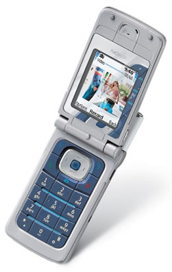
The new Nokia 6255 - a CDMA flip phone with video functionality running on the "Series 45" platform, will be launched soon and you can see that unlike many of their recent phone launches, Nokia has gone back to basics on the design. Fantastic. That phone is truly lustworthy - and not just because of the functionality, but because of the clean lines and useful design.
I think all of us Nokia fans are pretty sick of the wacky unusable keypads, odd shapes, and questionable usability aren't we? I mean, more power to Nokia for having the kahunas to try something new, but I'm sick of being an apologist. "Look at this great phone! Yeah, yeah, I know it's a bit weird. But it's so cool!" Now that they've been bitchslapped by the market in the last quarter it looks like they're going to get back to basics. Actually the quid-pro-quo may not be direct since the design for the 6255 probably happened years ago, but I think that they'll now make more of an effort go in that direction, starting with this phone.
I expect the 6255 to be huge success because it's both clean and functional. What's the hottest consumer product on the market right now? Right - the iPod Mini. Look at it. It's *ridiculously* simple in design and usability. It's not over-designed, it's not shockingly new, it's elegant and beautiful and clean. This is the future of all mobile products.
Consumers like simplicity, cleanliness and functionality. Apple truly understands this as does Sony - look at the PowerBooks and the SonyEricsson Z700 for examples. Look at TiVo. It should be a mantra for any consumer product development team: simplicity and functionality. The 6255 is a fantastic phone for this reason. It's not boring, it's beautiful. We've got enough clutter in our lives, no? The devices we carry with us during almost all our waking ours should not add to it.
-Russ