My 7610 Review
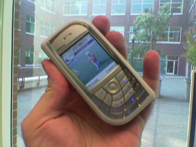
Yes, believe it or not, after long last I'm putting pen to paper so to speak and banging out my Nokia 7610 Review. First, let me tell you what took so long: the first one I had sucked. I mean, it was ugly (the black one), it didn't run Opera and some other apps, was unstable (it was bluescreening, believe it or not), the keyboard bugged the hell out of me, the default icons were horrible, it only took a RS-MMC, and the interesting pre-installed apps (see below) didn't work. But I knew it was a pre-production model and felt that ripping the phone a new one wasn't very fair.
So I put the phone in my bag and went back to my beloved 6600 and put the review off. Christian sent me a new one just the other day (a production model) and I can say that I'm quite whole-heartedly happy with it - enough to pass off my 6600 to my wife and use the nice white 7610 as my new primary phone. It's that nice. It's not perfect - I'll touch on why in a minute, but it's definitely a generation ahead of the 6600 and worth dealing with any warts there may be.
Hardware
First, let me talk about the actual device itself. It's much thinner than the 6600, and the white model is quite nice to look at (it has an iPod air about it.). I'm not sure if it's lighter than my 6600, but it definitely feels like it - it's much less bulky in my pocket. The screen is the same quality - if a little brighter - and there's a standard Nokia pop-port on the bottom for charging and to plug in accessories like a headset or the integrated USB sync cable.
Though I generally like the shape and size of the phone, the keypad took a lot of getting used to. You basically end up clicking with your finger nail which isn't the greatest feeling. I prefer the feel of the 6600 - though I know of others who hated that keypad. I just don't like it when I'm in a quiet room using the 7610 sending a text message for example, and with each key press, there's a loud *click click*. Also, the joypad isn't as nice as the 6600's joystick or even the 3650's joypad. And the placement is so odd as well, it took me the longest time to get used to where certain keys are (the "c" clear key for example) and answering the phone at first took me a couple tries. The other flaw is the power button - it's impossible to find and press. If you use that button to flip between profiles (silent, meeting) or even as a way of lighting up a locked-phone so you can unlock it, it's very difficult to use. Anyways, this keypad was definitely designed during Nokia's wacky-keypad phase, so hopefully this will be the last monstrousity I'll have to deal with on a S60 device.
Other than the keypad which - despite my moaning - is pretty easy to get used to, the phone is pretty great. I like the nicer camera images and I love, love, love the ability to take video that goes up to 10 minutes. It seems like an arbitrary limit, but I've yet to take a video anywhere near that length. In fact I'm glad there's a hard limit: because the base is flat, it's quite easy to set the phone upright taking video (say of a in-office mini-basketball game) and then forget it's running so that the phone continues to take video until you run out of storage.
And speaking of storage - I've been using my regular sized 128MB MMC card in the phone, even though it only has a slot for a Reduced Sized MMC (RSMMC). Someone left me a comment a while back saying that all it takes is a little force and that it'd work and they're right. Getting the back off afterwards is sort of a pain, but the memory card works like a charm. Doesn't even seem to bend the card at all either. Hopefully someday I'll be able to buy a decent sized RS-MMC, but until then I can use my existing hardware.
The speed of the device seems a lot snappier. I haven't looked it up, but it seems to either be improvements in the OS or the chip is faster. Either way, it's noticeably more quick to use. And finally, the 7610 came with an integrated USB Sync cable which, after you've installed the highly annoying drivers (I must have clicked "yes" to the prompts 9 times) works quite well. I have to say I like how the N-Gage cable worked better, though it wasn't able to see the phone's storage, it worked a lot more seamlessly. The 7610's cable is much more of a pain to install and use.
The Phone System and Software
Okay, here's where the really interesting bit of the phone is. Once I got over the keypad, I was quite happy to find a faster, refined OS with improvements in various places over the 6600. Small example: The Bluetooth icon on the home screen is actually a Bluetooth "B" instead of that non-descript black circle. Much nicer.
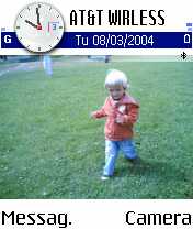
Also a huge improvement is being able to scroll through the top of menus. In other words, if you're in an app and you click the option key, if you press upwards, you arrive at the bottom of the menu - where the Exit option always lives. That makes getting in and out of applications much, much easier. It's a small detail, but one I noticed right away and which improves the usability of the phone considerably.
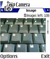
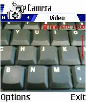
Another nicety was in the combination of the camera and video applications. I have the "camera" app tied to my right button on the home screen, and now happily that also brings up the video app as well. Very cool. What's not cool about this is the speed of the images being saved. On one hand the images that you capture are *exactly* what you saw on the screen, not an image a half a second later. Since I'm used to the delay on the 6600, it's quite surprising to get exactly the image that was on the screen when I clicked the capture button. But on the other hand, the looooong delay of saving the image is really frustrating. I probably could cut it down by decreasing the quality of the image, but I *want* the higher quality. Like I said, the base of the 7610 is flat and now with the integrated Timer in the options menu, you can set the phone up to take pictures of the family without needing to prop it at all. Very cool. One thing that does sorta frustrate me is that the phone remembers the last mode you were using. So if you took video last, when you open the camera app again, you're dropped into the video mode. That's great, but personally I'd rather have it always default to the camera - I'm not sure why - because there's been several times when I wasn't paying attention and started taking video by clicking, when what I really wanted to do was snap a shot (which has now passed). But this is just me, I guess... the right thing is to remember your "state", I just have to get used to it doing the right thing.
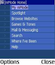
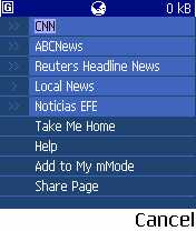
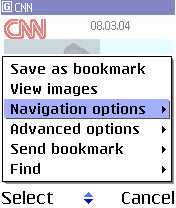
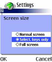
There's also vast improvements in the integrated XHTML minibrowser. Though still not anywhere near the capabilities of Opera, it has improved immensely by using more real estate (semi and full-screen modes) and by including "auto bookmarks" which is just a history organized by site. Since many times you browse through a WAP or XHTML site and later want to go back to a specific page you found without having to hunt through menus again, this is very useful. I still can't log into Bloglines with the browser, though, so it obviously has problems with cookies or sessions or something. That could be a bug in Bloglines or the minibrowser, but the fact that I can do this in Opera says much about the maturity of Nokia's browser: It's still not there yet. Obviously they are making strides in that direction, but don't throw out Opera just yet. I don't know what the "standard" apps are going to be in the various markets, but my phone (which came with Finish instruction manuals) had Opera pre-installed, so that's good. But I'm not sure where Nokia is going to go from here with the improvements in their own browser and investments in Minimo. Why didn't they just buy Opera outright? It doesn't make much sense. Part of the reason I hated my first 7610 was because it wouldn't run Opera. It's *that* important of an app...
Okay, most of the other apps like Notepad, ToDo, Recorder, Log, etc. are the same from what I have seen. I'm still amazed that the integrated email client doesn't have a timer option to check for new messages. Even my 5 pound 3G Moto phone had that option and that UI and OS sucks in comparision. My only guess is that Nokia doesn't want to get sued by Research in Motion, which seems to have patents on anything doing with email-by-mobile devices. Surprisingly, Snake and MixNMatch were missing from the Games folder. There might be some functionality or changes that I'm missing, however, I just learned the other day that you can have MP3 files as your ringtones in Series 60 Feature Pack 1, so I'm sure I'm missing a thing or two. Please leave a comment if there's something I missed.
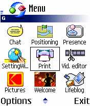
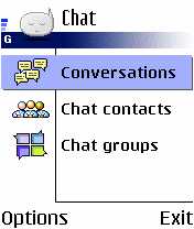
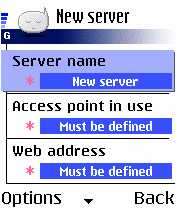
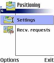
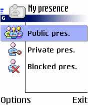
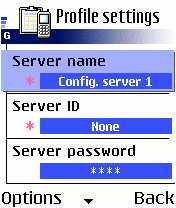
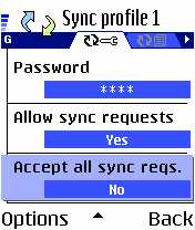
There are several new default user applications including Chat, Presence and Positioning and there were a few others that I had to install which I'll talk about in a sec. I haven't been able to play with the new default apps because I don't have the proper server settings. I *think* these apps have to do with the OMA's Wireless Village intiative, but I'm really not sure. I'm quite eager to try the apps, and the functionality has been integrated into the Contacts app as well so you can see if someone is online and launch a chat from within your Address Book. Also new is the SyncML application which used to be a separate install, and in the Tools folder there's an app called the Device Manager. All of these new apps need specialized servers to work, so even though they're *all* interesting, I only know about SyncML - signing up with a service like MightyPhone will allow you to back up your contacts, etc. but the rest of the servers are a mystery to me. I really worry about all the different servers that users are expected to know about and maintain now. If you count GPRS, MMS, Email, SyncML, Chat, Presence, Positioning and Device Management? It's overwhelming: The next version of Nokia's apps will need to integrate all this into Settings somehow - even though that app is already way too complex for most users already.

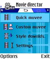
One of the most interesting integrated apps is the new "Movie" app which creates "muvees" from your videos. It would seem to me that the better app to have integrated into the phone would be the Video Editor application that came on the included 64MB RS-MMC card, but still it's pretty neat. I blogged about it before - it basically takes a video you took and creates a little 10-second MMSable music video. It's been created so that you can customize the types of music and effects, etc. by downloading new MuveeStyles and will be interesting to see if people do much with this app.
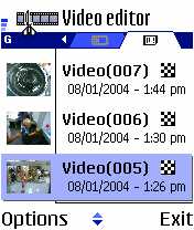
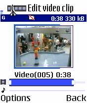
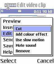
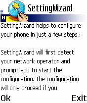
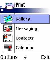
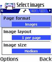
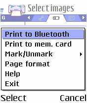
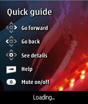
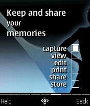
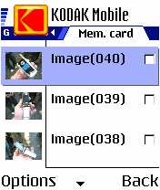
The apps that are on the included RS-MMC which you need to install include the Settings Wizard, a HP Bluetooth Printing app, a Video editor (for cutting and combining videos), the Kodak Ofoto app, a 7610 Welcome App (very cool and written in Java), and of course the handset version of Lifeblog. I'm not able to use the Settings Wizard as it's only for non-U.S. markets, and I don't have a HP bluetooth printer - the there is an option to "Print to mem. card' which baffles me. The Video editor is definitely going to be very useful at some point to post videos to my moblog. And the welcome app is incredibly well done - it's got moving graphics and music in the background and generally does quite a lot for a Java app, very cool. (The Java support, by the way, seems *miles* ahead of the 6600's horrible implementation: at the bare minimum platformRequest() works.).

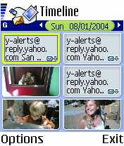
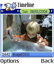
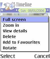
The Lifeblog app is of course the star of the phone and it works pretty much as advertised. I can scroll back through the days and see little icons with the text messages that I sent or received that day as well as thumbnails of the images or video I took as well (and I can rotate the images, etc.) I can then select some and add them to my favorites, which will get transferred to my PC version of Lifeblog. Because it happens automatically, it's one of those apps I'm not sure if I'll use on a daily basis, but I can see it being very, very useful to find an image or post that I took on a certain day a while ago. It's almost as if the application should be called History or (as the title in the app shows) Timeline, rather than being branded as a "blog". But it's still a very neat concept and time will tell how much it is actually used.
PC Software and Syncing
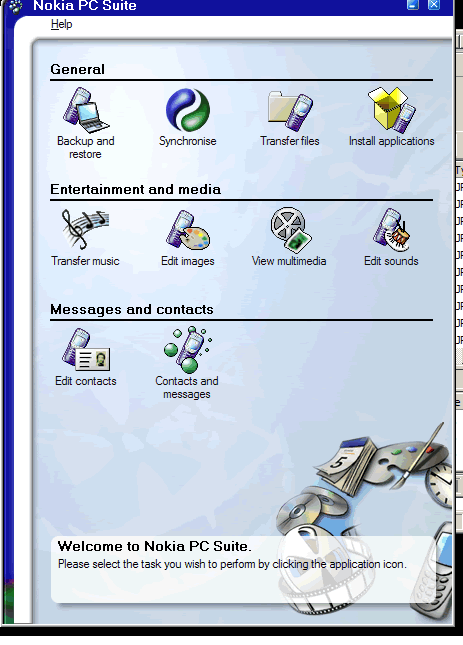
This is where I have to bash on Nokia a bit. The PC Suite continues to be an abomination on my desktop. I cannot possibly think of an app which is more frustrating to use in my entire life. The entire PC Suite team needs to be taken out to a Finish wood somewhere and beaten senseless as they've proved year in and year out that they just can't get it right. It's horrible. Fantastically unusable and insanely frustrating. Getting your phone to connect is a Sisyphean task where what works now doesn't work 2 minutes later, and even when you can start to get things connected reliably, the apps don't actually work. If you're familiar with previous incarnations of the PC Suite, Nokia has changed the app so that instead of a monolithic app, there's actually some sort of launcher which has icons for backup, sync, app install, contacts, etc. None of which actually work as advertised. And, of course, in order for any of this to work, Nokia installed both the Sync Cable drivers and the PC Suite task-tray to auto-start in my registry. Urgh. I've complained about how far behind the PC Suite is to the Palm Desktop, and this version only puts it *farther* behind, which is really a shame.
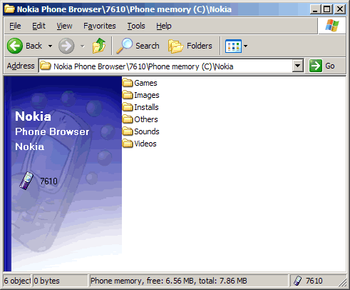
Though happily, one thing does work - the connection to the phone. There's an integrated Explorer icon now that allows me to browse my phone over the USB cable or via Bluetooth. This is great for grabbing a ton of files quickly - especially the much bigger 1 megapixel shots or long videos - and not have to wait for Bluetooth, and being an Explorer integration means that it's much easier to cut/paste the files where I want them on my computer.
That said, I cannot, cannot, cannot get my phone to sync with my PC. I've uninstalled everything and reinstalled it again, grabbed the latest apps off the web and tried again, I've tried Bluetooth and the USB cable (which in theory should "just work") and I just cannot get my phone to sync my contacts *or* more importantly with the desktop version of Lifeblog. I have beat mercilessly on my computer to get it working and tried every permutation possible and still no go. I can't figure out why it should be failing, but it is. And it's a shame because I really want to play with Lifeblog, but have to do it by importing, not syncing. I'm going to post more about Lifeblog right after this.
Summary
So in summary, the white 7610 looks *great* and though the keypad takes some getting used to, it is actually useable. The S60 system has been improved in various subtle and substantial ways which are really nice, all my software works well, the Java support is good and the integrated apps are intriguing - if for the moment, unused. The connection to the PC is where this phone should really shine, but has so far only showed me only disappointment. Hopefully someone will leave me a comment and I'll see how dumb I've been and recant. :-)
Whew! Done! Look for my Lifeblog post coming ASAP.
-Russ