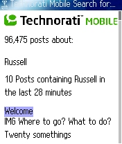
Mobile Blog Search: Reformatting vs. Rethinking

Since I'm the "mobile blogger guy," I kinda feel its my duty to point out that Dave Sifry has announced Technorati's new blog search for mobile phones. I'm glad to see these guys (and other startups) getting a start on mobility! However, I have to say I am dissappointed with the results so far. Now I know these guys personally, and they're a small company working on a tight budget and they're not mobile experts, so instead of slamming them, I'll try be constructive. Yeah? Okay. The key is to stop reformatting and start rethinking.
Technorati on the Web is compelling to Web Users, right? (Who doesn't like exploring links and tags and stuff...) But Technorati Mobile is definitely not compelling to Mobile Users yet. Why? Well, obviously mobile phones aren't PCs. Giving someone a stripped down version of a site and saying, "There ya go! Happy?" isn't going to work. It's a good start for a mobile service but it's far from compelling. Technorati isn't alone here - Check out aolsearch.com vs. mobile.aolsearch.com to see how they are simply transcoding (i.e. stripping down) the results. Good, but it's not enough.
So let's think about where Technorati can go from their very basic mobile version, to one that's compelling for its mobile users. What can Technorati do to make mobile users want to pick up their phone every morning and check Technorati Mobile out? Well, quite a bit.
First this "optimized for the Palm Treo," stuff has to go. You can't just support one type of high-end smartphone and call your stuff mobile. It's hard work, but you have to just accept that you need to support the zillion other handsets that are out there. You can focus on a basic XHTML version or you can use more automated solutions - there are open source projects which can help, and lots of expensive commercial products as well - but the fact is you can't ignore all those mass market phones. The power of mobility is in its ubiquity - there's no real upside to launching a free service focusing on such a small subset of the market, you need to focus on the masses. Throw away the Treo and start using a regular mobile phone like everyone else (or at least have a couple - or 15 - in your bag like yours truly), then roll up your sleeves and get to work.
Three main things to worry about when reformatting pages for mobiles: 1) Page length, 2) Image Sizes (both dimensions and kbs) and 3) External Links. Right now Technorati does okay on the page length, breaking up their results, the only image is the logo which is sized only for Treo displays, and it doesn't have any solution for external links, simply letting its mobile users guess whether these links will go to a mobile-viewable site or not. Since Technorati's whole reason is to find content on other sites and they can't control how those sites are formatted, I would suggest that the results that come back from blog searches have longer snippets rather than just few sentences that's being returned now. That will give quickly give mobile users much more functionality, without having to click through to the external sites.
But that's just the search piece, where's the rest of Technorati?!? You can't ignore the full lifecycle of your users. In other words, your mobile users need to be able to 1) sign up, 2) sign in, 3) do all of the other things that a Web user can do on the PC. Why need to have a PC at all? A true Technorati Mobile site would be just as usable to a mobile user as to a PC-based one, right? There's always issues with this, I know. For example, full-on URLs for searching are sort of a bitch to tap out on a keypad, right? Hey - that's just an opportunity, not a problem. Any time you run into issues like that, if you can solve them with an innovative solution (say an easier way to manage URLs via a mobile) you suddenly gave your service a competitive advantage by making it easier for your users and thus more compelling over all. Hell, don't just throw your Treo away, throw your PC away as well and see how functional Technorati is for you. ;-)
So that's reformatting and functionality, but what about rethinking? Well, there's a lot more to mobility than just mobile web pages. Though the Internet guys don't like to think about it, the best way to get people to use your mobile data service is via SMS. They key to Blackberry's success is the constant reminders to check email, right? Mobile users rarely Pull - to them it's all about Push. You have to prompt them - especially here in the U.S., otherwise they'll never take their phone out of their pockets. Technorati could become a juggernaut tomorrow if they realized what would happen if they hooked up their Watchlists with SMS. Even as a premium service (since SMSes cost cash). Look at some of the neat new alert services over at NextBlast. WTF isn't Technorati doing that? I don't know, but I'd guess it's probably because they're siloed into Web-only thinking. That's got to change.
There's a whole mobile world out there ready for Technorati to tap into. What are the most popular mobile services? Which operators are people talking about? What are the most popular phones? What deals are being offered? What ringtones are peope blogging about? Which wallpapers are out there? Which Java games do people talk about. Technorati Mobile shouldn't just be the regular Technorati available to mobile users, it should be Technorati FOR mobile users.
I hope this helps... I can't wait to see the next version. :-)
-Russ