Redesign Using Handheld CSS

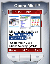
Tonight's MoMo topic on advanced Mobile Web Browsers got me thinking about mobilizing my site again. Now that Opera Mini has been released and more people are getting decent mobile browsers in their hands, I've been meaning to get around to creating an alternative stylesheet using the "handheld" media option. This is something that was a hot topic in oh say, 2004, but it was a bit ahead of its time. Even I didn't bother making a permanent one until this weekend.
Actually, I used the opportunity to redesign my site in general as well. I've been on this simplicity kick for my blog since the beginning of the year. I removed the comments (famously and controversially), removed the graphics in the header (my picture is on the About page now), gone to a basic black and grey color scheme, and now limit the front page and archive pages to one day of postings at a time. This really focuses a reader on the content, I think, as well as having the bonus of making the site more accessible to mobiles. I've even gone and removed my text ads, which is actually a pretty big monetary sign in my mind of how serious I am about re-focusing this blog, don't you think?
Anyways, the decision to go with less postings on pages (I used to be of the opposite mindset of "more on a page is better") is to better guide my readers to one idea at a time. Yes, I've got almost 3,000 posts spanning over three years, but much of that is ancient history, no reason to shove it down your throat. If you want to find older info about a topic, you'll do a web search like everyone else anyways. This sparing use of posts has the added bonus of keeping pages at a reasonable size for mobiles. Yes, advanced web browsers can take 300kb pages, reformat them and present them, but there's a reasonable limit - a few posts at time is good, I think, especially since I usually write pretty long posts.
So back to the handheld style - I'll have to admit I had lots of problems with it. First, I'm not a CSS guru, so I'm a little confused about how to stop inheritence and other tricks like that. Secondly, there's a real wide range in how browsers interpret various style sheets. In theory, unless your browser is supposed to deal with a specific media type, it should ignore it. But instead, I was seeing the stylesheets being combined into one, which made designing for a specific browser tough. And like I said, this was a hot topic in 2004, and most people basically said "it's pretty broken now, let's wait a rev before we get too excited." A great example of sporadic support was in the Opera Mini client - I made a little header graphic, and was using background-image style to set it, but it wouldn't show up. Not sure why. But on the other hand, I was able to use CSS to get rid of FeedIcons at the top of te page by adding display:none to the menu items with images - finally a really good reason to use list items in my menu! The end result is pretty good. I'm still not overly excited this way of publishing to mobiles and feel I probably need to tweak the server logic to get a really good mobile page (especially if I used Javascript or Flash or somethign), but it's nice to be able to have more control over how your site looks on Opera or Netfront with a simple style sheet.
I'll be curious to know what the people behind the new browsers being shown at Mobile Monday tonight feel about the Handheld media type. Opera and the W3C are the ones really pushing it - but the selling point of the Nokia, Minimo and Access next-gen browsers are the fact that they both render a normal web page, and make it easy to navigate them as well. The browsers don't even announce to the server that they're "mobile" in fact, and claim that they can handle all media types, etc. just like a PC browser. So whether those guys embrace the idea of alternate styles or not, I'm not sure. It'll definitely be my first question to all of them. :-)
See you tonight!
-Russ