Handheld Stylesheets


I hadn't seen that Opera had launched their My Opera community portal until just now... It's still pretty small (it says just over 300k members at the moment) but it has a bunch of basic services including groups, blogging, moblogging and photo albums. Very cool. But the coolest part is every single page has an associated handheld media-type stylesheet associated with it to make browsing via mobiles that support it (i.e. Opera mobile) faster, easier, more pleasing and generally more efficient.
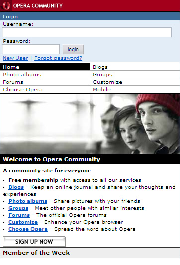
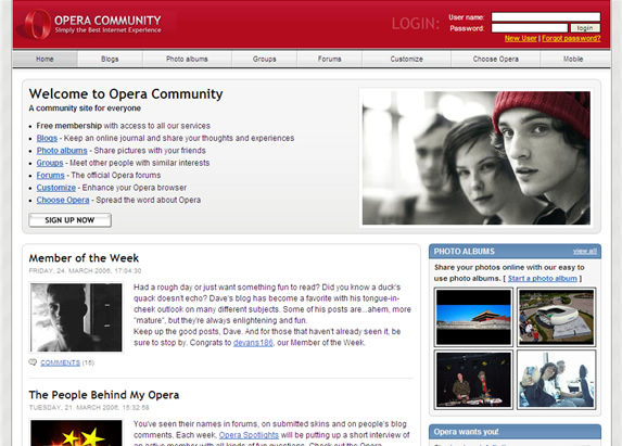
This is very cool! They're totally eating their own dog food and it looks great! I took the above screen shot to give you an idea of what they're doing. The top two are from the mobile version and the bottom one is the same page styled for the web (reduced a bit to fit in my blog template). Both mobile pics are from the same stylesheet, but because the css is made to be flexible, the design squeezes in width to the size of a standard S60 browser very well, everything just flows like it should. And the small touches are great - see how the main image is actually a different version from the web design and the header, fonts and menus have all been changed? But it's still the same underlying markup. And this works for the whole portal like this, so for example if you sign up for a blog, you also get a mobile readable/usable blog as well. That's pretty awesome.
I used Opera's web browser to take the screen shots because you can hit shift-f11 and get into "small screen rendering" mode, and browse around like you were using a mobile, which is good to test things out. But I normally use FireFox as my main browser which doesn't have this functionality built in. But the cool thing is that my favorite FireFox plugin, the Web Developer Extension, has included a small screen view in its menu, so you can check out how your site would look in a mobile browser, and if you have a handheld style sheet, it'll pick it up as well. It's not as good as Opera's because it does stick between pages, but it makes tweaking the design using the CSS editor sidebar really easy.
I have to say I'm getting more and more convinced that this is the direction that the mobile web is going to go. No recoding markup, no "separate and always unequal" access to content, etc. Just include a different style sheet on your server and you can re-arrange your web-standard markup as you see fit. I've been trying to find "good" examples of XHTML-MP (WAP2) sites out there lately, and there really aren't a whole hell of a lot I can find. Yet, if you look at the handheld-style on the Opera pages, there's a lot to learn there in terms of designing for mobile size screens. The pages look clean and usable, yet they still have a compelling design to them as well. Imagine if the whole of the mobile web was like this instead of hanging on to the legacy of WML and the "page of links" format style? It'd be a much different mobile world, I can say that.
God, it's been almost three years since I first saw that Lonely Planet XHTML home page with tables and colors and backgrounds, etc. But since then I've seen almost nothing equivalent in the real world - I don't even think LonelyPlanet even offers that mobile version any more, I can't find it on their site. This has little to do with the handset support, and has everything to do with the basic fact that creating two separate versions of your website is just impractical. Different stylesheets though, are a completely reasonable alternative.
You know what the mobile web needs? A mobile version of the CSSZenGarden. That would really go a long way towards showing everyone what great sort of designs you can do even in a size-constrained environment like a mobile phone, and maybe spur a bit more innovation in that area, no? Now that Opera Mini supports Handheld CSS (and other smartphone browsers as well), this is a much more relevant area to think about. Two years ago, it was still a dream (as Dave Shea himself pointed out in 2004), but now handheld stylesheets are available even to mid to low-level phones that can use Java. That changes everything.
In fact, this might be a fun project. First I'm going to send off a note to Dave to see if he's interested in maybe doing a "mobile month" for the zen garden or something, where all the designs submitted take the basic html template and turn them into pages meant to work on mobile phones (with Opera mini being the primary focus). That would rule. If not, I just registered HandheldCSS.com and may do this myself... I'd love to see some good designers really push the limits in mobile design and show us what's possible.
-Russ