iPhone viewport tip

Yes, I'm still geeking around with Apple's latest.
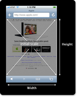
I use Gregarious as my news feed reader and I wanted it to optimize it a bit for the iPhone's display, so I started mucking around with their template and CSS. Unlike some of the other stuff I've done, this wasn't something I was doing from scratch, so I was trying to figure out how to tweak the existing stuff so that it looked better on the phone. In the end, I finally ended up just putting a couple lines of PHP code in the header to swap out the CSS all together if it saw an iPhone in the user-agent, and also adjusted the viewport meta tag as well.
Here's the quick tip: When I first read about the viewport's options, I couldn't figure out why you would ever want to specify "user-scalable=no", as it seems like it would limit yourself quite a bit. But after messing with the CSS for a while, I realized that if you set that option and a specific width (say 320 for portrait) then it's much faster to scroll up and down with a finger flick - as the iPhone never wonders whether it's going to be zooming or moving right or left. It actually ends up optimizing that page for scrolling up and down quickly. Though I'm sure you can get this same effect a few different ways, grokking this makes it much clearer to me.
I still don't actually get the whole viewport concept though, I have to admit. I guess I need to keep messing with it.
-Russ